Tonic App by Canopy
Client: Canopy, Agency: Type/Code, Duration: 11 months
Role: UX/UI Design, Design Lead, Oversaw Product Development
The final launched version in Apple App Store
Background
Tonic is an iOS app that delivers personalized content recommendations to users without storing any of their private data. Tonic is powered by Canopy engine which uses a technique called differential privacy to understand user’s preferences without needing to learn their identity. I was part of the product team that be brought in to help Canopy develop the app.
Note: CNN acquired Canopy in April 2020.
Problem & Goal
People Problem: People are tired of their data be collected without consent and unable to control their privacy.
Business Problem: Finding a Product-Market Fit for Canopy technology.
User Goal: Discover the best of the internet while protecting my personal data.
Business Goal: Productize Canopy’s on-device machine learning and differential privacy technology.
Success Metrics
User happiness (in app survey collection of user satisfaction)
Engagement rate (the amount of content consumption per user in a given time)
Adoption rate (the number of unique downloaded)
Retention rate (percentage of beta users who continue engaged with Tonic app)

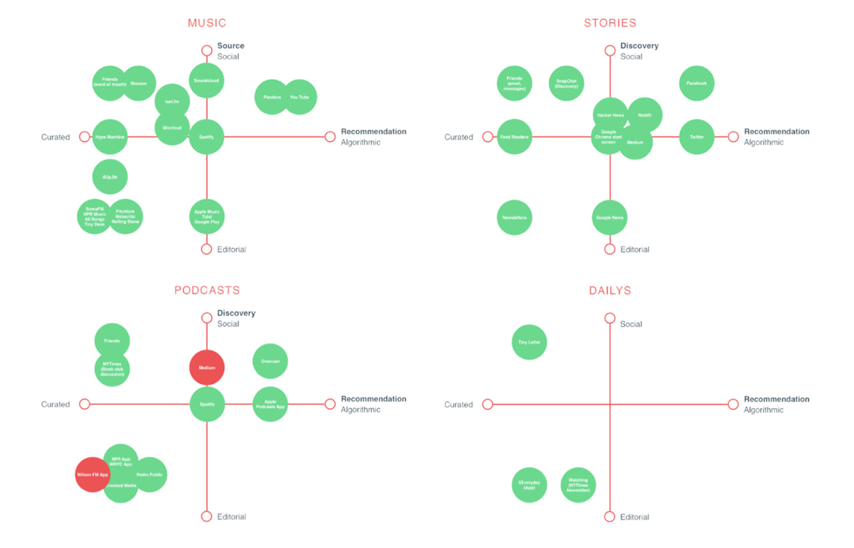
A competitor landscape allows us to develop counter-strategies based on accurate and reliable data.

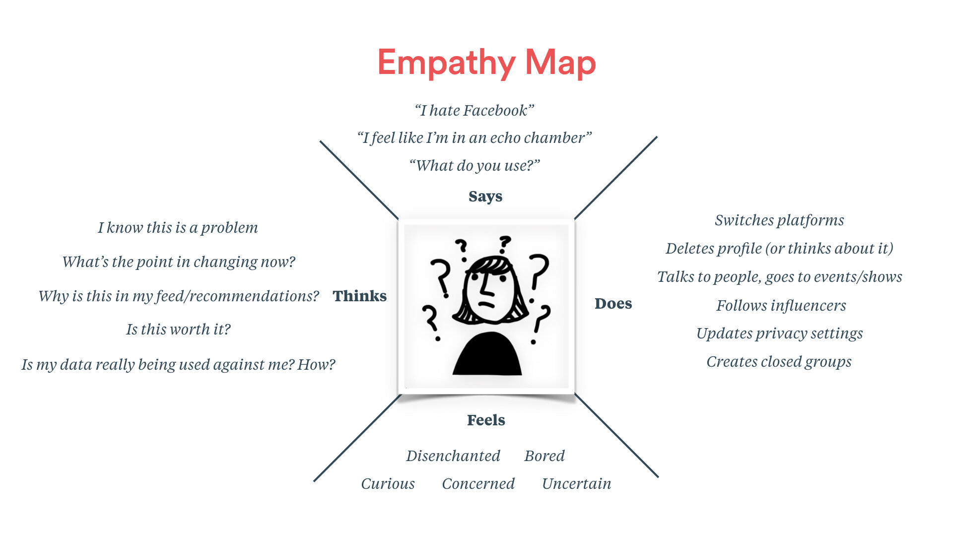
Empathy map helps us understand our users and communicate the needs amount the team.

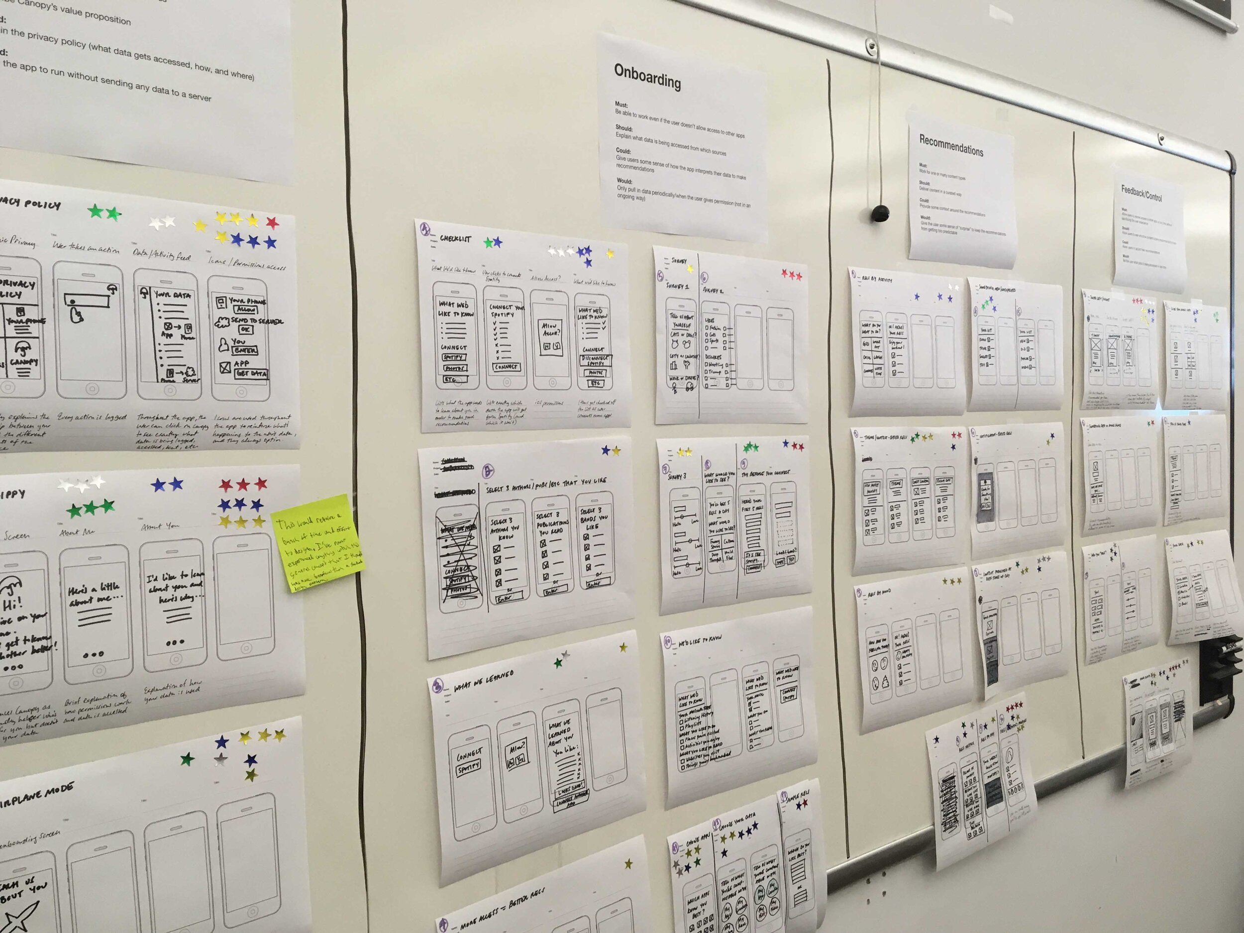
Team collaboration to sketch out some initial ideas and further prioritized them into each product release.

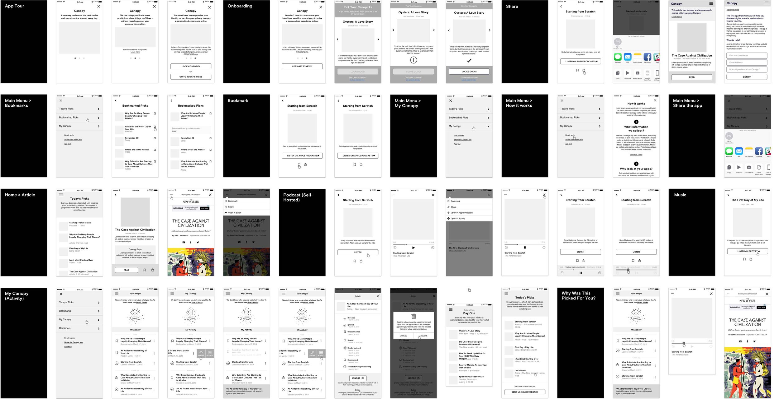
Once our concept had been tested and validated, we began architecting the user experience of the app in its entirety. Using wireframes, we defined the app’s information architecture, navigation, content, and interactivity.
Research & Pain Points
We started our journey with interviews and surveys to define the immediate problem and learned more about the behaviors and attitudes surrounding the current content recommendation landscape.
I need a way to get new content recommendations without relying on Facebook because I’m tired of the echo chamber.
I need a way to get accurate content recommendations without relying on my social network because I don’t feel like I’m getting good recommendations from people I know.
I need a way to discover new things quickly, without having to spend a ton of time on social media because I’m tired of the time suck/social media is making me unhappy.
I need a way to get trusted content recommendations without relying on biased, inaccurate, or opaque recommendation algorithms.
I need a way to get private content recommendations because I’m tired of giving away my personal data and worrying about how it’s being used against me.
I need a way to get local content recommendations so that I don’t have to answer a lot of generic questions that I’m never really sure how to answer in some cumbersome onboarding process.
Leveraging Google Forms to gather more qualitative data from a larger group of people around their feelings and behaviors about data privacy.
Insight
Data Privacy: People don’t know what to do to protect their private data, and feel that nothing they can do will make much of a difference anyway.
Social Media Behavior: While most people find recommendations through social media, the endless content has begun to take its toll. People are beginning to question its effects on their health.
Algorithmic Recommendations: People were happiest with their content recommendations were the ones who avoided algorithmically-generated recommendations in favor of human-curated ones. “There's a cultural context and a community around it. Even if I don't necessarily like everything that they play.”
After rounds of user testing, we were surprised by our finding, People who are “concerned” about data privacy and people who were apathetic were exhibiting the same behavior when it came to protecting their data privacy, which is (largely) nothing. The more we tried to explain our dedication to privacy, it only invited more skepticism.
(2,000 Beta Users, 18 User Testing Sessions)
Key Takeaways & Trade-Off
People don’t seem to understand, believe, or care about the distinction between data that is stored locally on their phone vs data that is being stored on a server. When transparency and control are meant to serve the user’s best interests, people tend to balk at their data when they see it.
The concept for a bite-sized, highly-curated, daily mix of content resonated with those for whom the endless scroll was becoming a daily grind, so we Focusing on highlight the human side of connecting people with great content and Tonic brand in the MVP, forgoing some of the more technical privacy expressions in favor of simplicity.
Building the Tonic community to differentiate the product from other big players in the competitive landscape.
Iterative Product Design
I worked as an extension of Canopy’s product team, gathering feedback from Beta users, concepting, evaluating, prototyping, and testing new ideas and solutions as part of an iterative cycle until we found the right product-market fit.
User testing example on 3 content discovery concepts. We found the typical cumbersome generic questions onboarding don’t resonate with people, there is more context to each decision making when it comes to discovering contents.
Private by Default: Zero account. Users don't need to sign in to use Tonic. Nothing is stored in the cloud.
Human Editorial Voice Powered by Custom-Made Machine Learning Tools: Thematic human curation and a point-of-view are critical in allowing Tonic to recommend a variety of content without feeling random.
Curated Bite-Size Content: No scrolling through endless feeds. Tonic offers only a handful of thoughtfully curated selections each day.
Free From Echo Chamber: Providing other bits of context allowed us to recommend things somewhat outside of the user’s comfort zone and offer an element of surprise.
Content-First Onboarding: Using the real contents in the onboarding flow lets users share specific positive signals rather than vague category interests.
The onboarding process was designed to emphasize content over preferences, relieving users of the mental exercise of choosing which topics they like and allowing them instead to be immediately immersed in interesting articles, building their own playlist of content. This also serves to seed the algorithm with the information that is most useful in determining what to recommend users next—a positive signal about the content they are interested in.
Branding: Our UI embraced the organic shapes and soft palettes of Canopy’s branding. The Canopy logo became the metaphor for a private space that is personalized to the user and free from outside influences.
People loved the intentionally limited selection of content they received from Canopy each day, and they didn’t want to feel like they were missing out. One of the first features we added to the app for the Beta test was a notification setting that allowed the user to set a daily reminder at the time of their choosing.
Transparency: No data is not being collected or stored on a server. We show people how the algorithm weighs their activity to make future recommendations, and a simple mechanism for allowing them to adjust it.
Although the user’s data is not being collected or stored on a server—an aspect that our early testers found hard to believe—we still wanted to be transparent about the data that is being tracked, even if that data never leaves the user’s phone. We also knew from our research that some of the worst platforms for content recommendations are the ones that are either too opaque in how their algorithms work or offer a false sense of control. Through ideating, prototyping, and testing we landed on a concept that gives users a glimpse into how the algorithm weighs their activity to make future recommendations, and a simple mechanism for allowing them to adjust it.
Design as a system: I worked on the design specification and work closely with the Tonic development team to speeding up the design to development workflow and improving productivity.
Learn more about the design process, go check out Type/Code Christin Roman’s Medium post here.
Lesson Learned (Beta to Launch)
A simpler way (swappable picks) to giving personal preference on each content. Long press to swap a pick for another one.
Building Tonic community and a friendly brand while introducing the privacy advantage.
Tonic automatically rates what people read but people should always have the control to override it.


