Google Play Trending
Client: Google Play Team, Agency: Type/Code
Role: UX/UI Design
Background & Task
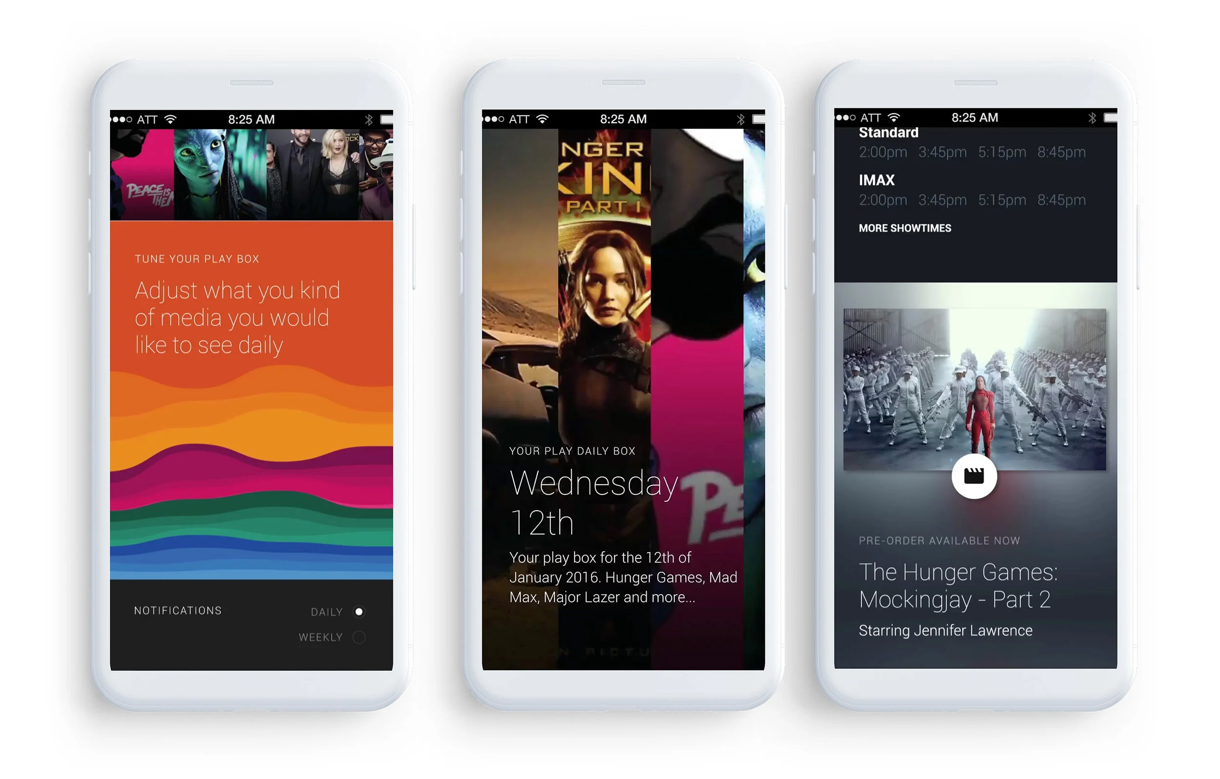
Google tasked us with exploring ways to improve users’ discovery of movies, TV episodes, music, and books in the Google Play Store. The previous design works well with the type of user who knows exactly what they are looking for but it's lacking the opportunity of "you may also like this."
Research & Problem
By leveraging Google Play team’s user behavior analysis, we’ve learned there are opportunity to motivate users to consume more content within Google Play platform. We wanted to understand the current surrounding environment by conducting a competitive landscape research to answer the following questions.
How other platforms motivate their users to consume more content?
What problem are they solving and how are they doing it?
What mistakes can we learn from? What can be improved?
What is our competitive advantage?
Goal
In the past, the Google Play Store was organized around the task-oriented use case of directed exploration, like “I want to watch a comedy” or, “I want to listen to the album ‘Ok Computer’.” This organizing principle had limitations in that users only gained exposure to content they were already familiar with. Our goal was to design an experience that surfaces new but related content to users, preempting the questions like:
Why should I care about all this new stuff I see on the Play Store?
I like this content, where can I consume it?
While our collaborating team at Google refined the technical process through which these bundles of content could be algorithmically generated, we focused on refining our design system into a set of modules that could be mixed and matched to surface various kinds of content, in interesting ways, around lynchpin media.
Design Iteration
As the types of content we were designing around became progressively more codified, we spent several iterations experimenting with how these bundles could be presented in as compelling a manner as possible. Our design thesis was centered on weaving this content into a unified narrative, that together assembles a comprehensive story – not a list of disparate articles, videos, and links. We could lean on several editorial design conventions, striking a balance between a holistic visual language, and allowing the content of each segment to inform its final aesthetic.
We had zero control over what images might be available for a given piece of supporting content. By algorithmically identifying dominant colors in supporting content images, we could dynamically set the color palette of a given segment, and use image blurs and color treatments to set abstract section backgrounds. We ultimately established a set of scenario-based rules (Is there an image? Is it dark or light? What is its base color? What is its accent color? What Material Design palette colors do these map to? Can this image be used as an abstract background?) to inform how each segment should be composed based on its own attributes.
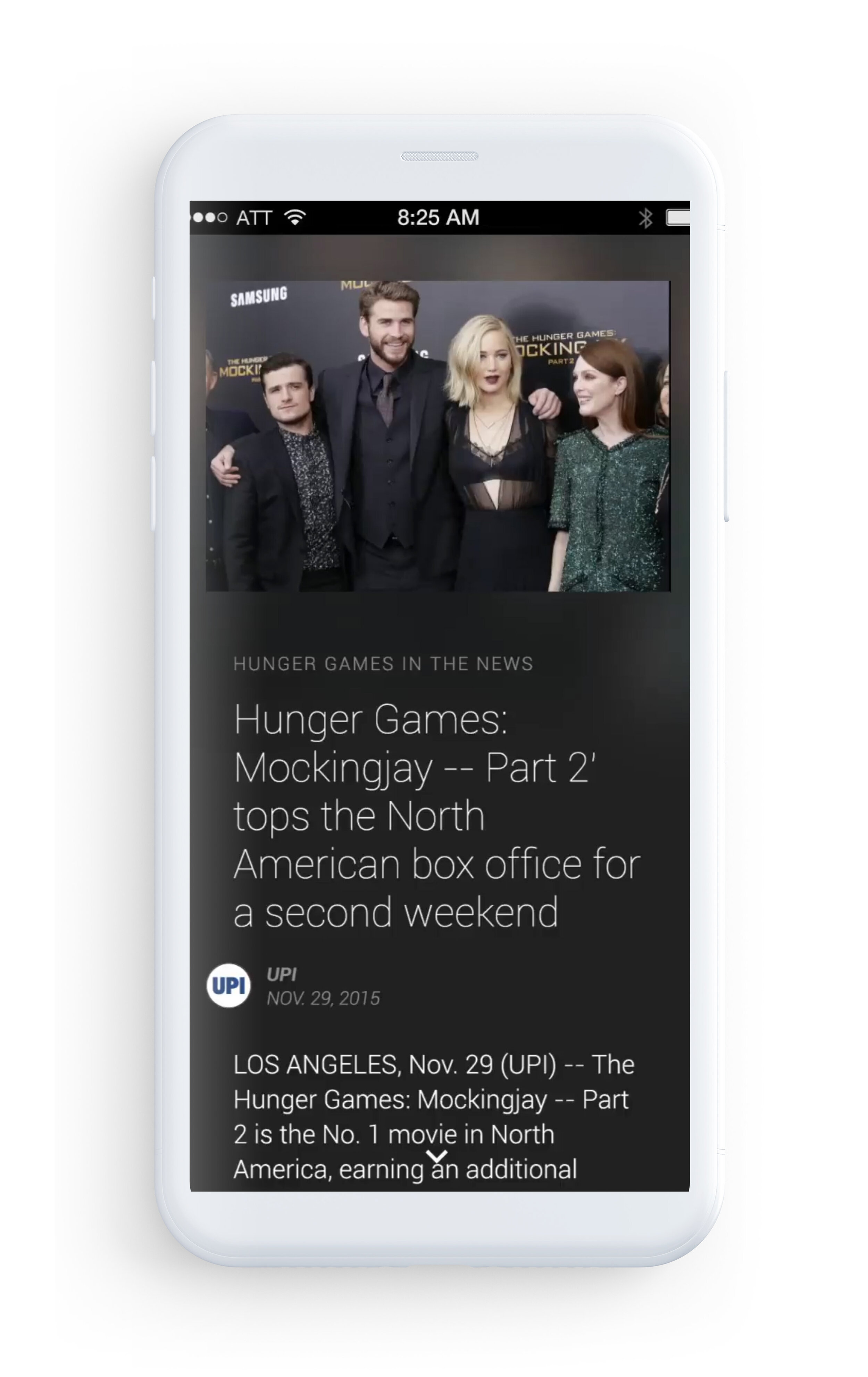
Starting with a new story.
Trending stories are seeded with an article or a news story about a piece of media, actor, artist, or musician.
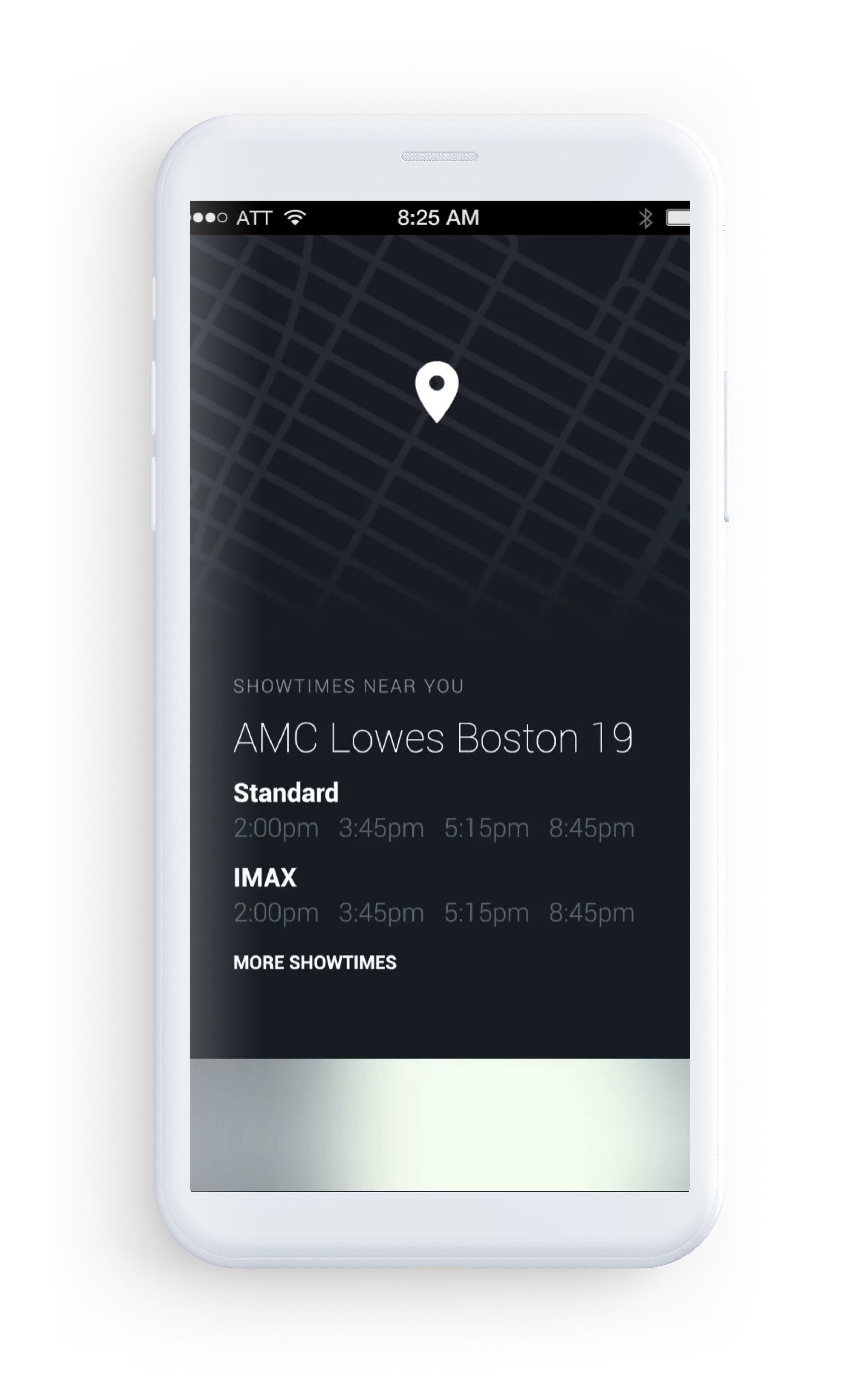
Contextual content
Based on the user's location, we explored opportunities for contextually relevant content such as movies, showtimes, or concerts.
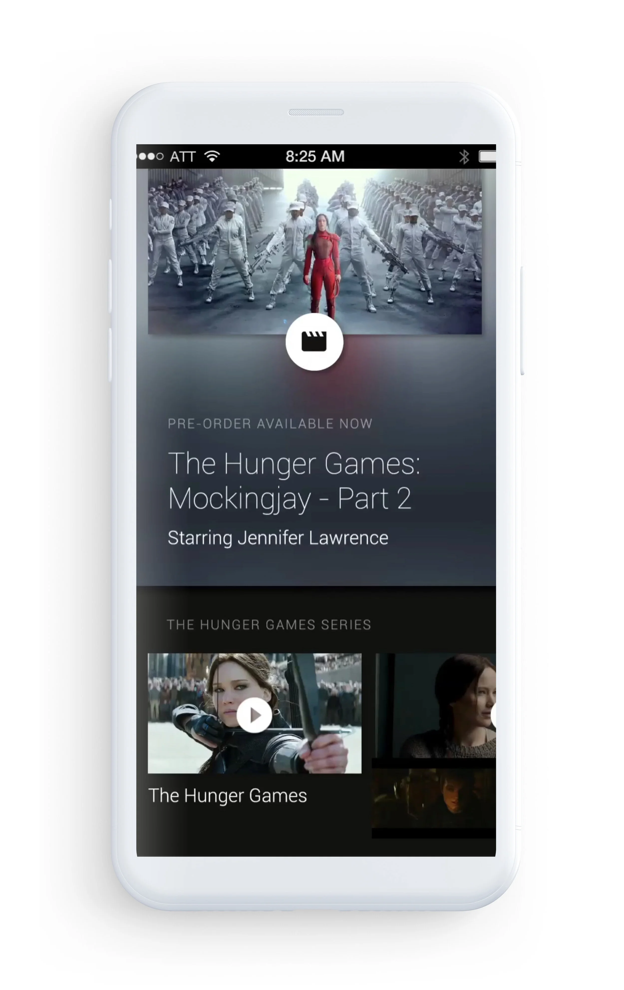
Rich Previews & Related Content
Media previews load inline, continue playing while a user continues to explore the story, and can be flicked away when users are finished viewing them. Other pieces of content that are related to items in the trending stories are surfaced, such as other works by the director.
Outcome
The Google Play Store Trending section started rolling out to a subset of users in mid 2016, and after seeing strong initial engagement with the beta, the feature was launched to all US users by the end of 2016. While we are unable to share any specific numbers, we are able to say that both engagement time with Trending bundles, and subsequent conversion on media featured within these stories, are moving very much in the desired direction.


