Harvest Chart
Client: Data Supply Co., Agency: Type/Code
Role: Product Design and Data Research, Award: Information is Beautiful 2019

Background & Task
The Harvest Chart was initially conceived as a print design project under Data Supply Co. brand, however, after collecting the data (about 110 crops, across 50 states, for each week of the year) and prototyping various visualization approaches, the team ended up needing to develop custom software to efficiently and accurately explore various data permutations and visualization approaches.
Problem & Pain Points
People Problem: What produce is growing near me right now?
Produces are mostly harvested weekly and undergoes a bell curve life cycle (low season > peak season > low season). A simple “yay or nay” for whether or not an apple is available in NYC during August doesn’t describe the seasonal growth of a crop accurately.
Despite state-sponsored agricultural organizations, all the resources are only to inform people of a crop being available or not. It doesn’t tell people whether or not produce is available near me.
Business Problem: How can we reduce the overhead cost to provide all our customers with a print that contains information specific to their planting zone.
Design Process
Using weekly crop harvest data reported by the USDA and NASS, along with supplemental crop season data from the NRDC and various state agricultural organizations, the weekly percentage of each crop’s full seasonal yield is visualized in a streamgraph that can be filtered by state and crop type.
The Harvest Chart reveals the seasonal ebb and flow of each crop’s availability within a given region, and the aggregate seasonal harvest trends across multiple crops within a region.
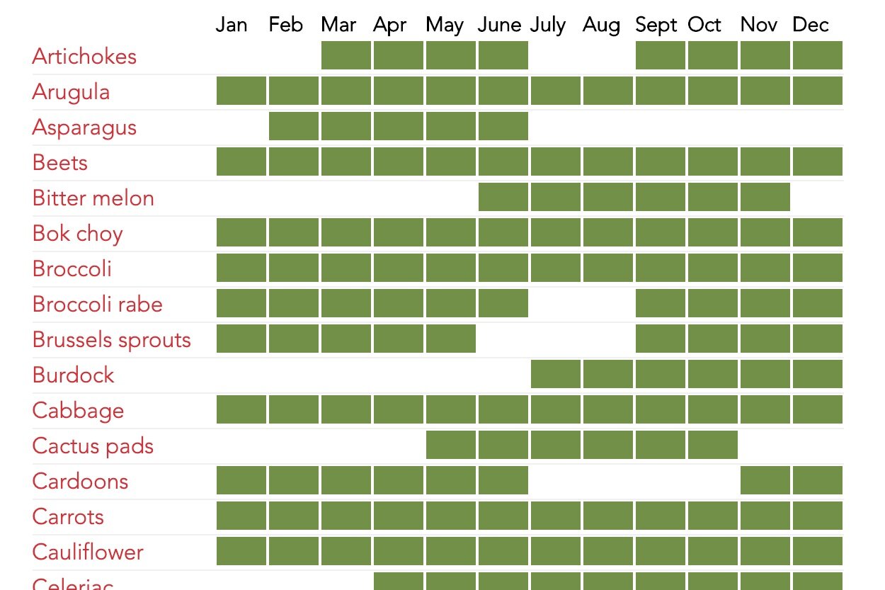
The typically available chart doesn't effectively communicate a bell curve life cycle (low season > peak season > low season), or allowing people to compare data across multiple states.

With the aid of USDA weekly data, it allowed me to understand the relative percentages of available crops in one particular agricultural regions such as New York.

During the collective design workshop, we landed on a streamgraph because it primarily centers on a stacked area chart over the x-axis. The streamgraph makes each area’s stream more readable independently, so the data become easy measuring at any given point.

Each crop is assigned a representative color to be easily identified at a glance, with specific weekly values revealed when hovering over each crop’s stream.
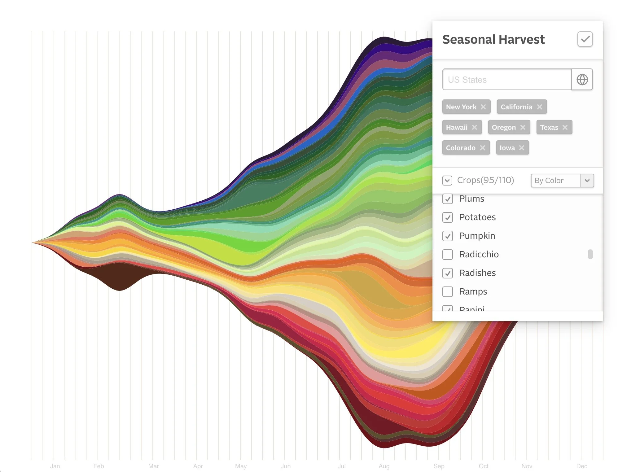
Users can filter the data across multiple states concurrently (averaging each crop’s yield across states) to explore crop availability across a more extensive multi-state region. This way, the chart tells a more comprehensive story of what local produce will likely be available at a farmer’s market during any given week of the year.

Multiple sorting options are available, to sort crop alphabetically, by “peak” harvest week, or by crop color.
By default, the chart will surface the popular crops in a given state to avoid overwhelming data visualization.